What Your “Contact Us” Form Is Really Telling Prospects
Your contact form sends signals before you reply. Learn how its tone and setup influence conversion and trust.
Your contact form isn’t just a tool – it’s the first impression families get of your community. If it’s cluttered, confusing, or hard to use, you risk losing leads before they even hit “submit.”
In this guide, we’ll show you how to design a form that builds trust, reduces friction, and converts visitors into leads. You’ll learn:
-
Why design and language matter as much as functionality
-
Common mistakes that drive families away
Let’s break down what works – and what doesn’t – when it comes to creating forms that reflect the care and professionalism families expect.
What Your Contact Us Form Communicates to Visitors
Your contact form does more than collect information – it sends a message about your community’s values and attention to detail. From the layout to the wording, every element shapes how visitors perceive your commitment to care. A simple button color or the spacing between fields can leave a lasting impression.
How Design Affects Trust
The look and feel of your form play a huge role in building trust. For families navigating tough decisions about senior living, a well-designed form can offer a sense of reliability and professionalism.
Font size and contrast are especially important. Older users need easy-to-read text, so high-contrast fonts are a must. For example, black text on a white background is inviting, while light gray text can feel inaccessible and frustrating.
White space and layout matter, too. Overcrowded forms with too many fields can overwhelm visitors, while a clean, organized design shows that you’ve put thought into their experience. A well-structured form says, “We care about making this process easier for you.”
But design isn’t the only factor – your choice of words also plays a big part in how families feel about reaching out.
Using Clear and Comforting Language
The language on your contact form sets the tone for the entire interaction. Families often feel stressed or uncertain during this process, so your words should ease their concerns, not add to them.
Field labels should use simple, relatable terms. For instance, “Preferred move-in timeframe” is much clearer and more approachable than “target occupancy date.” Similarly, “Tell us about your loved one’s needs” feels warmer and more personal than “resident care requirements.” These small tweaks show that you prioritize clarity and empathy over formalities.
Error messages are another opportunity to show care. Avoid harsh, technical messages like “Error: Invalid Input.” Instead, provide gentle guidance, such as, “Please double-check your email address so we can get back to you.” This kind of messaging reassures families that their concerns will be handled thoughtfully.
Confirmation messages should reflect the sensitivity of the inquiry. A generic “Thank you for your submission” might feel cold, while a message like, “Thank you for reaching out. We’re here to support you every step of the way,” conveys compassion and builds trust.
Even the best language and design can fall short if certain pitfalls aren’t avoided.
Common Mistakes That Drive Prospects Away
Some design and content choices can unintentionally frustrate visitors, making them less likely to complete your form. These mistakes often stem from prioritizing internal needs over the visitor’s experience.
Overloading required fields is a common issue. Asking for too much information – like detailed medical history or financial details – before building a relationship can feel intrusive. Families are more likely to abandon forms that demand excessive details upfront. Stick to the essentials and keep it simple.
Vague privacy policies can create anxiety. Families want to know their sensitive information is safe. If your form lacks a clear privacy statement or includes ambiguous language like “we may share your information with partners,” it can raise red flags. Be transparent and specific about how their data will be used to build confidence.
Poor mobile design is another dealbreaker. Many adult children research senior living options on their phones, often during busy moments. Forms that require horizontal scrolling, have tiny buttons, or display poorly on smaller screens can frustrate users. A mobile-friendly design ensures they can easily connect with you anytime, anywhere.
Unclear submission confirmations leave families in the dark. Redirecting to a generic “thank you” page without explaining what happens next can make prospects wonder if their inquiry was even received. A clear follow-up message – like, “We’ll contact you within 24 hours to discuss your needs” – shows that you’re organized and attentive.
How to Design Contact Forms for Senior Living Prospects
When families are exploring senior living options, they’re often navigating a mix of emotions – stress, uncertainty, and hope. A well-designed contact form can ease this process, while a poorly thought-out one can add unnecessary frustration.
Keep Forms Simple and Easy to Use
Stick to the essentials. Ask only for the basics like name, phone number, email, and preferred contact time. Save additional questions for later. Every extra field you add increases the chances of someone abandoning the form, especially when they’re already juggling tough decisions.
Prioritize readability. Use fonts sized at least 16px with plenty of spacing. This makes your form easier on the eyes and reflects an understanding of your audience’s needs.
Provide helpful placeholder text. For example, use prompts like “Weekday mornings” for contact preferences or “Within 3 months” for move-in timelines. These small hints make it simpler for families to give you the information you need.
Make error messages helpful, not frustrating. Instead of showing a generic “Invalid input” message, say something like, “Please check your phone number format (xxx-xxx-xxxx).” This small detail shows empathy and reinforces the care they can expect from your community.
Your form’s simplicity should extend across all devices for a smooth experience everywhere.
Make Forms Work on Mobile and Desktop
Design with mobile users in mind. Many adult children research senior living on the go, often using smartphones during breaks or commutes. Ensure buttons are at least 44px tall and input fields are spaced far enough apart to avoid accidental taps.
Test on real devices. Don’t just rely on simulations – try your form on actual phones and tablets. Make sure it loads quickly, displays properly, and doesn’t force users to scroll sideways.
Ensure the process works seamlessly. From filling out the form to submitting it, everything should function smoothly across different devices and browsers. A single glitch could discourage a family from reaching out.
Break up longer forms into steps. If you absolutely need more details, use progressive disclosure. Divide the form into manageable sections, especially on mobile screens where space is limited. This keeps the process from feeling overwhelming.
Once your form is functional and user-friendly, focus on building trust with those who are considering your community.
Add Trust Elements Near Your Form
Highlight your privacy policy in plain language. Instead of burying it in legal jargon, say something simple like, “We will never share your personal information. Your privacy is as important to us as the care we provide.” Place this statement right below the form where it’s easy to see.
Add a personal touch with staff photos. Include a photo and short bio of your admissions director or another key team member. For example: “Sarah Johnson, Admissions Director – I’m here to answer your questions and guide you through our community.” This humanizes the process and makes it less intimidating.
Set clear expectations for response time. Let families know how quickly they’ll hear back, such as “We respond within 2 hours during business days.” This reassures them that their inquiry won’t be ignored.
Incorporate social proof. A brief testimonial near the form can go a long way. For example: “The staff made it so easy to get information and schedule our tour.” Keep these quotes focused on the contact process itself rather than general praise.
Show your credentials. Display your community’s license numbers or accreditations prominently near the form. Families comparing multiple options will appreciate this transparency and reassurance that you meet regulatory standards.
Using AI to Improve Lead Qualification with USR Virtual Agent
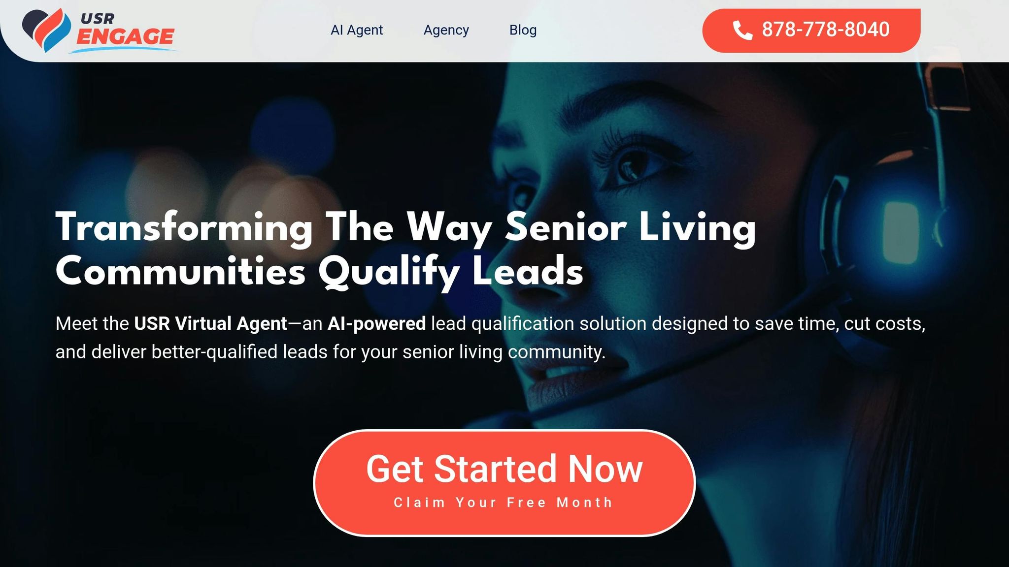
When families reach out about senior living, they’re often looking for immediate answers and reassurance. Traditional contact forms may gather basic details, but they often leave families waiting during critical moments. AI-powered tools like USR Virtual Agent change the game by offering instant, compassionate responses that reflect your community’s dedication to care.
How AI Delivers Compassionate, Real-Time Support
-
Always Available: Families search for senior living options at all hours, and USR Virtual Agent is ready 24/7.
-
Handles Complex Questions with Empathy: Unlike rigid scripts, the agent engages in meaningful conversations. Whether it’s discussing memory care options, pricing ranges, or specific services, it keeps the tone supportive and understanding.
-
No Limits on Interactions: Forget busy phone lines or long hold times. USR Virtual Agent manages multiple inquiries simultaneously without breaking a sweat.
-
Never Misses a Lead: If a call comes in after hours, the system records voicemails and follows up quickly, ensuring no opportunity slips through the cracks.
Smarter Lead Management Through CRM Integration
USR Virtual Agent doesn’t just chat – it works seamlessly with your existing CRM to simplify lead management. Every interaction is automatically logged, eliminating manual data entry and reducing errors. This means your team gets well-organized, detailed leads without the extra work.
By gathering critical details about each prospect’s needs, the system empowers your admissions team to personalize their approach. Plus, it captures trends and insights from conversations, helping you address common questions and highlight the features families care about most.
This efficient data flow sets the stage for a clear comparison between manual and AI-driven lead management.
Manual Lead Management vs AI-Powered Solutions
Here’s how traditional methods stack up against USR Virtual Agent:
| Aspect | Manual Lead Management | USR Virtual Agent |
|---|---|---|
| Response Time | 2–24 hours | Instant, 24/7 availability |
| Lead Qualification | Basic form data with follow-up calls | In-depth pre-qualification via conversation |
| Concurrent Capacity | Limited by staff availability | Unlimited simultaneous interactions |
| Data Accuracy | Prone to manual errors | Automated and consistent |
| Follow-up Consistency | Dependent on staff workload | Standardized and reliable |
| Weekend/Holiday Coverage | Often unavailable | Full coverage, no interruptions |
The advantages of AI become crystal clear during busy times. While manual systems can slow down, creating bottlenecks and risking lost leads, USR Virtual Agent scales effortlessly. It ensures every inquiry gets an immediate, meaningful response while enriching lead data – reinforcing your community’s dedication to providing exceptional care.
Tracking and Improving Contact Form Results
Your contact form is the bridge between casual website visitors and qualified leads. Without proper tracking, you lose the chance to fine-tune your strategy and maximize its potential.
Key Metrics to Watch
-
Conversion Rate: For senior living communities, a healthy conversion rate ranges between 2% and 8%. If your form is underperforming, it might be time to reassess its design or messaging.
-
Cost per Lead (CPL): This typically falls between $150 and $600. By optimizing your contact form, you can lower this cost by generating more qualified leads from your existing traffic.
-
Response Time: Quick follow-ups are essential. Families often contact several communities at once, so responding promptly can make the difference in securing a tour or building trust.
-
Lead Conversion Tracking: Monitor how many form submissions turn into tours and eventual move-ins. This helps measure the quality of your leads and the effectiveness of your follow-up process.
Using A/B Testing to Sharpen Results
A/B testing is a powerful way to refine your contact form and the landing pages that lead to it. Test different headlines, like comparing “Get More Information” with “Schedule Your Personal Tour”, to see which resonates more. If conversions are lagging, evaluate the form’s length – asking for only essential details can often boost submissions. Tackle one change at a time to clearly identify what works. These ongoing tweaks ensure your form stays effective in driving leads and supporting your overall goals.
Conclusion: Building Trust and Getting Quality Leads
Your contact form isn’t just a box to fill out – it’s the first handshake with families considering your community. If the form feels cluttered, confusing, or buggy, it sends the wrong message. Families might wonder: if this process feels messy, can they trust you with their loved one’s care?
Instead, aim for simplicity and warmth. A clean, user-friendly form with clear language and compassionate messaging reflects the care and attention families can expect from your community. It’s not just about gathering information – it’s about building trust right from the start.
Tools like USR Virtual Agent take this a step further. For $497 a month, this AI-powered solution delivers empathetic, 24/7 responses, handles multiple conversations at once, and syncs seamlessly with your CRM. The result? Your team gets pre-qualified, high-quality leads while focusing their energy on the conversations that matter most.
To keep your forms effective, regularly test different elements (like button placement or language) through A/B testing. Monitor response times and lead quality to ensure you’re meeting families’ expectations. A well-designed contact form isn’t just functional – it communicates professionalism, empathy, and reliability. When done right, it becomes the foundation for relationships that lead to move-ins and lasting satisfaction.
FAQs
How can I make my contact form easier for older adults to use?
To make your contact form more accessible for older adults, prioritize clarity and ease of use. Choose large, readable fonts and high-contrast colors to improve visibility. A clean, single-column layout keeps things straightforward, while minimizing distractions helps prevent confusion.
Add simple, concise instructions to guide users through the process, and ensure error messages are clear and easy to follow. Generous spacing between fields and buttons makes the form easier to navigate and interact with. These thoughtful touches not only improve usability but also help create a smoother, more trustworthy experience for everyone.
How can AI, like USR Virtual Agent, improve the way senior living communities handle contact form inquiries?
AI tools like USR Virtual Agent are changing the way senior living communities handle contact form inquiries, offering some game-changing advantages.
For starters, they’re available 24/7, meaning potential residents and their families can get answers whenever they need them – even outside typical office hours. This constant accessibility makes the experience feel more welcoming and responsive.
Beyond that, AI takes care of repetitive tasks, freeing up staff to focus on meaningful, one-on-one interactions. Prospects benefit too, with instant responses and customized communication that feel personal and trustworthy. These features not only simplify the inquiry process but also leave a lasting impression, helping to build stronger connections with future residents.
What should a privacy policy include to make prospects feel confident about data security?
A well-crafted privacy policy should make it clear how user data is collected, used, and stored. It’s also important to spell out the security measures your organization has in place to safeguard this information, along with the actions you’ll take if a data breach occurs. Be sure to include details about user rights – like how individuals can access or request deletion of their data – and ensure your policy aligns with legal requirements such as the GDPR or CCPA. Being open and transparent is essential to earning and maintaining trust with your users.
Ready to Transform Your Lead Management?
USR Engage's AI agents qualify leads 24/7, so your team can focus on what matters most — converting prospects into residents.